Is MailerLite Better than MailChimp? A Quantitative Approach
We wanted to see if the data we looked at for The Touchpoint Envelope really showed that MailerLite was better than MailChimp


In our post about The Touchpoint Envelope, we took a look at open and click rates from MailerLite and MailChimp. The reason we looked at those was to validate the idea of The Touchpoint Envelope (e.g. an audience reduces within the touchpoint envelope for each stage of a communications pipeline) but one thing stuck out to us – it looks like MailerLite has better open rates and click rates than MailChimp. Here’s a brief summary of the results:
On average, across all industries, MailChimp reports an average of 21.33% (range: 15%-28.7%) Open rate and an average of 2.62% (range: 1.3%-5%) Click rate.
For MailerLite, they report an average Open rate of 25.35% (range: 14.5%-39%) and an average of 3.82% (range: 1%-7%) Click rate.
From this, it looks like MailerLite is better than MailChimp by ~4% on Opens and ~1% on Clicks. That’s pretty huge actually.
So we decided to brush off our statistics and dig a little deeper into this. The reason it’s important to understand is that Open and Click rates are an important part of outreach. If one tool does a better job (for whatever reason), we should know that. Also, if you have to compare two tools (or three or four), then how would you go about doing that?
Can You Even Compare Something Like This?
The first step is to ask if this is even doable. The data above clearly shows that, on average, MailerLite has better Opens and Clicks but those are averages, which while important, can hide things like how things are calculated and on what they are calculated.
I do think you can compare such things but in order to do that, you need more than just average data. Thankfully, both companies report individual (albeit averages) for all sorts of different types of industries. These data points can be used to compare performance by using statistics.
That Which is Measured Improves
Back in the before-times, I worked as a semiconductor Product Engineer. The main job of a Product Engineer was to put new products into production, improve the yield of existing products, and do cost reductions.
Our primary tools for doing this involved a lot of experiments (what we called Splits) to see if certain treatments (changes) would improve yield or performance. In order to prove that treatments made a difference, we would perform the split and analyze the data using a Student’s T-Test or Welch Test.
Student’s T-Test and Welch Test
The t-test tells you how significant the differences between groups are. This means it lets you know if those differences (measured in means) could have happened by chance or not. The reason this is important is that we want to know if the treatment actually is doing something as opposed to the randomness of the process.
The difference between the T-Test and the Welch Test is that the Welch does not assume that the two populations have the same variance. Variance measures the “spread” of the data. A wide variance means that the data is all over the place while a small variance means that the data is tightly clustered. This is important because it shows the variability in the process that produced the data.
For our purposes, we’re going to select the Welch Test because it gives us the most flexibility.
Using Python, Pandas, and Jupyter Notebooks for Analysis
In order to perform this analysis, I’m going to use python, pandas, and jupyter notebooks to import the data and plot it. These tools are free and open source. Using them is beyond the scope of this post.
The setup is straightforward and reproduced below:
import pandas as pd
from scipy.stats import ttest_ind
import seaborn
# Data taken from https://mailchimp.com/resources/email-marketing-benchmarks/
# Data taken from https://www.mailerlite.com/blog/compare-your-email-performance-metrics-industry-benchmarks
csvfile = "Open-Click-Data.csv"
df = pd.read_csv(csvfile)
# Create separate data frames to make ploting a bit easier
df_or = df[['OR_MailerLite','OR_MailChimp']].copy()
df_cr = df[['CR_MailerLite','CR_MailChimp']].copy()
df_factor = df[['Factor_MailerLite','Factor_MailChimp']].copy()
The above gives us three data frames (Open, Click, and Factor) to run our tests on and to do some box-plots to look at the data. Graphing the data is an important part of the analysis so you can get a feel of what it looks like to give the results some context.
Setting Up the Analysis
The question we’re trying to answer is whether or not the two group means are equal. This is called the Null Hypothesis (Ho). The Alternative hypothesis (Ha) would be that the two groups' means are different.
The Welch Test will return the Welch statistic and the p-value (or probability) that they are the same. We select a p-value to prove or disprove the null hypothesis. Usually that p-value is set 0.05. This means that if the p-value is less than 0.05, then there is a 95% confidence that the null hypothesis is false or stated another way, that the means of the populations are not equal.
If the p-value is above 0.05, then the null hypothesis is true and the population means are equal.
If the population means are not equal, then that means one is “better” than the other.
Confusing? It can be and that’s why it’s important to graph the data to get a feel for it. The best way to do this is to use a box-plot, which I have done below.
Analysis #1 – Open Rates
The first analysis to run is to see if the Open Rates really are different between MailerLite and MailChimp. In order to do this, we need to run the following code:
ttest_ind(df['OR_MailerLite'], df['OR_MailChimp'], equal_var=False)
seaborn.set(style='whitegrid')
seaborn.boxplot(data=df_or).set(title="Open Rate Distribution")
This gives us the following results:
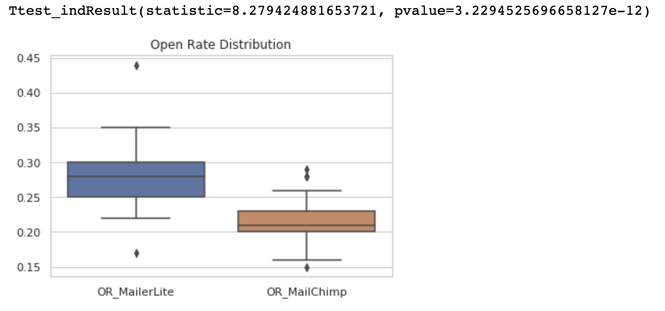
Notice the box-plot clearly shows that both the mean and the distribution of the data is higher for MailerLite than for MailChimp. The Welch test proves that out as well.
So, for Open Rates, MailerLite’s population mean is different from MailChimp’s population mean, t(42) = 8.28, p < .0001. This means that MailerLite’s Open Rate is higher than MailChimp’s.
Analysis #2 – Click Rates
Click Rates are another important metric for outreach. To run the same test for Click Rates, the following code was run:
seaborn.boxplot(data=df_cr).set(title="Click Rate Distribution")
ttest_ind(df['CR_MailerLite'], df['CR_MailChimp'], equal_var=False)
This gave the following results:
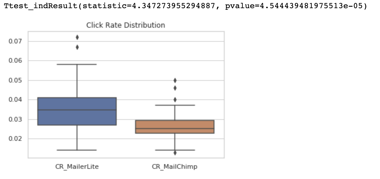
Notice on this box-plot that the populations have moved closer together but are still separated. The Welch test bears that out as well but to a lesser extent than for the Open Rates.
So, for Click Rates, MailerLite’s population mean is different from MailChimp’s population mean, t(42) = 4.35, p < .0001. This means that MailerLite’s Click Rate is higher than MailChimp’s.
Analysis #3 – Open to Click Rate Factor
If you read The Touchpoint Envelope post, you’ll know that the boundaries that make up the envelope are between a Factor of 2 and a Factor of 10. Said another way, there is a reduction of audience between 50% and 90% as you progress down the communications pipeline.
In order to remove the variability of email quality (e.g. subject lines and CTA’s), I took a look at this factor between the two populations by dividing the Open Rate by the Click Rate for each one. I then did the same Welch test on the data set as follows:
seaborn.boxplot(data=df_factor).set(title="Open to Click Rate Factor")
ttest_ind(df['Factor_MailerLite'], df['Factor_MailChimp'], equal_var=False)
This gave the following results:
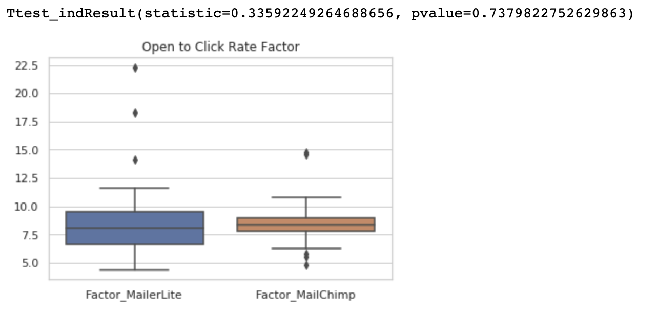
Notice that these box-plots are a lot closer together. In fact, they overlap a lot, which is evident by the Welch test results.
So, for the Factor of Open Rate / Click Rate, the populations are the same, t(42) = 0.336, p=.73. This means that both MailerLite and MailChimp give the same Open to Click Rate Factor. Put another way, you would get roughly the same click rate on emails that were opened from both.
What Does This All Mean?
You might be wondering what this all means and was it worth the effort. For me, it was fun (yeah, I’m a nerd) but it also shows that, for whatever reason, MailerLite performs better, on average, on Open Rates and Click Rates than MailChimp. This also shows that they are equal on the Open to Click Factor, which implies that once an email is Open, the Click rates are not statistically different.
Why Is It Important to Know This?
I’m not saying run out and switch your emailing tool from MailChimp to MailerLite (I don’t use either of them). What I do think you should consider is that if you’re getting consistent results from your Outreach (e.g. you nailed your Subjects, Bodies, and CTAs), then you might consider these results if you can’t improve anymore.
Of course, there are lots of other email tools out there that might be even better. So if you’re thinking about changing, why not do your own analysis to see if it’s worth the switch.