The Touchpoint Envelope: What Open, Click, and Buy Rates to Expect from Outreach
What open, click, and buy rates you might expect from your outreach efforts


One of the things I get asked a lot is what sort of results one should expect when doing outreach. I covered this in Story-Driven Outreach and called it the Factor of 10 and 2, which I thought was clever but hard to explain.
Upon reflection and reading an awesome post by Jason Cohen called The Elephant in the room: The myth of exponential hypergrowth, I decided to dig a little deeper into what open, click, and buy rates you might expect from your outreach efforts. During this deep dive, it became clear that calling it a Factor of 10 and 2 made no sense so taking my own advice, I came up with 25 titles (and subtitles) for this post. What I landed on was The Touchpoint Envelope.
The Touchpoint Envelope Defined
A touchpoint, according to the Cambridge English Dictionary, is an occasion when a business or an organization is in contact (= communication) with its customers, etc. or meets them, or a method of communicating.
This is exactly what I was trying to model in the Factor of 10 and 2, which coincidentally, creates an envelope in which the results of your outreach should fall.
Bingo. A new buzzword is born it into the world
Gathering Data for The Touchpoint Envelope
Again, outreach is part art and part science, with the goal to get someone to do something for you. In order to evaluate how good your outreach is, it’s best to have some rules of thumb to gauge your results.
The heuristic that I use was derived from one of the best direct mail copywriters that ever existed, Gary Halbert.
Gary’s observation was that a decent list with a good sales letter/outreach would get a 1% response rate. A hot list with an outstanding sales letter/outreach would get a 5% response rate. Back then, a response rate meant a sale.
You may be asking yourself how this applies to email or any other form of outreach, including a digital ad. It turns out that those numbers roughly hold for almost all types of outreach and, while not perfect, is a good rule of thumb.
For example, the modern equivalent of the sales letter would be an e-commerce landing page or email. For that, the conversion rates or sales vary widely depending on the industry and even the country.
According to SmartInsights, the e-commerce conversion rate, on average, in the U.S. is 1.96%.
Based on the above insights (and some more to follow), I came up with the original Factor of 10 & 2 as a good heuristic of outreach performance that you can use.
The Factor of 10 & 2 Creates the Envelope
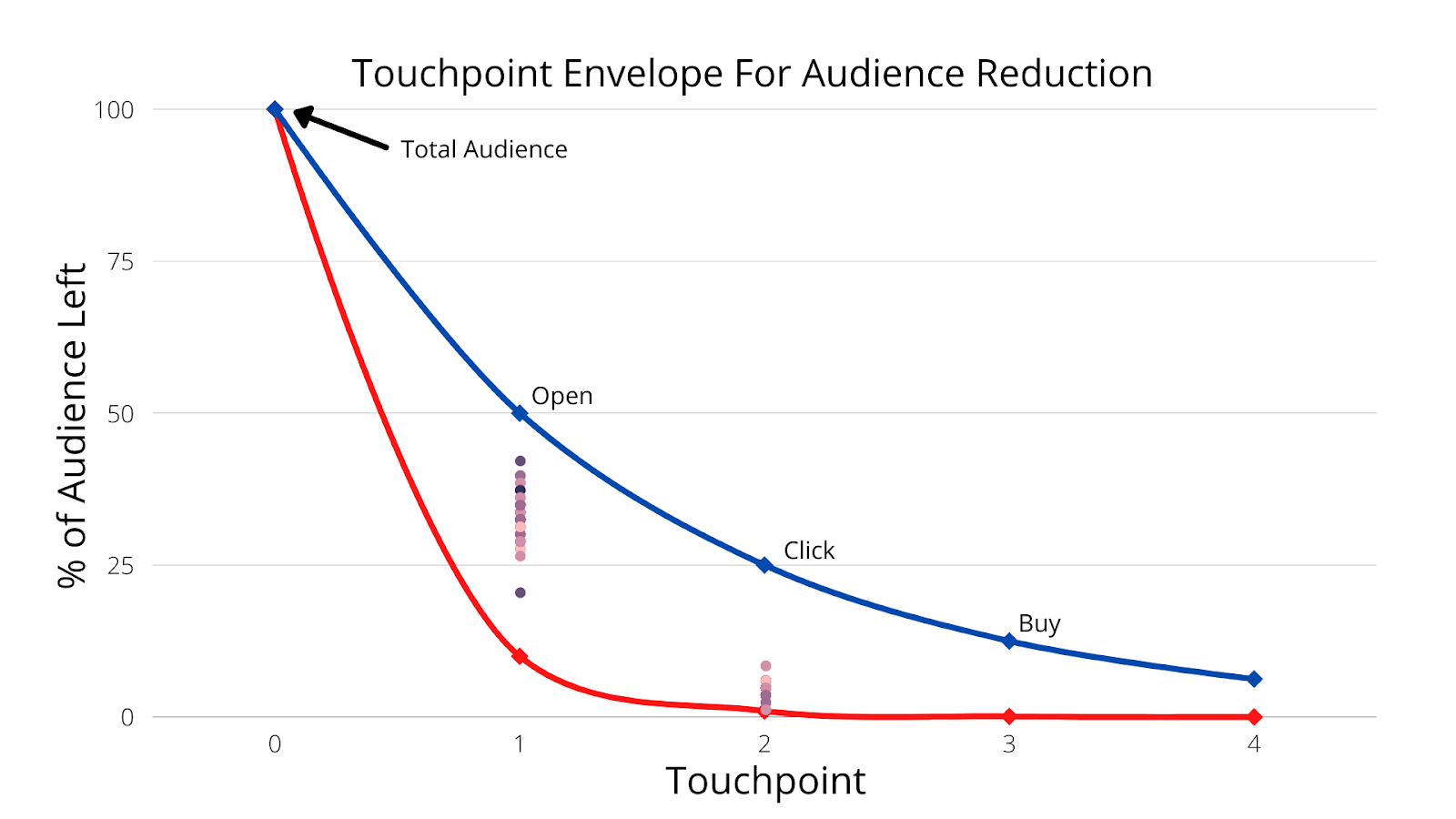
The Factor of 10 & 2 says to expect at least a factor of 10 and no more than a factor of 2 audience reduction for each touchpoint in a communications chain.
Put another way, divide by 10 to get the lower limit of engagement at each touchpoint and divide by 2 to get the upper limit. This creates the envelope in which your results should fall.
A touchpoint is an interaction with your outreach. As an example, for email, the first touchpoint will be an Open. The second touchpoint would be a Click, and a third touchpoint might be a Reply or a Buy or Signup. Each time a person has to do something, it’s considered a touchpoint and will generally reduce the audience for the next touchpoint.
In the chart below, this lower (red) and upper (blue) limit are the guardrails to evaluate your outreach and the audience you’re outreaching to. A healthy outreach and audience will land within the envelope between the lower and upper limit.
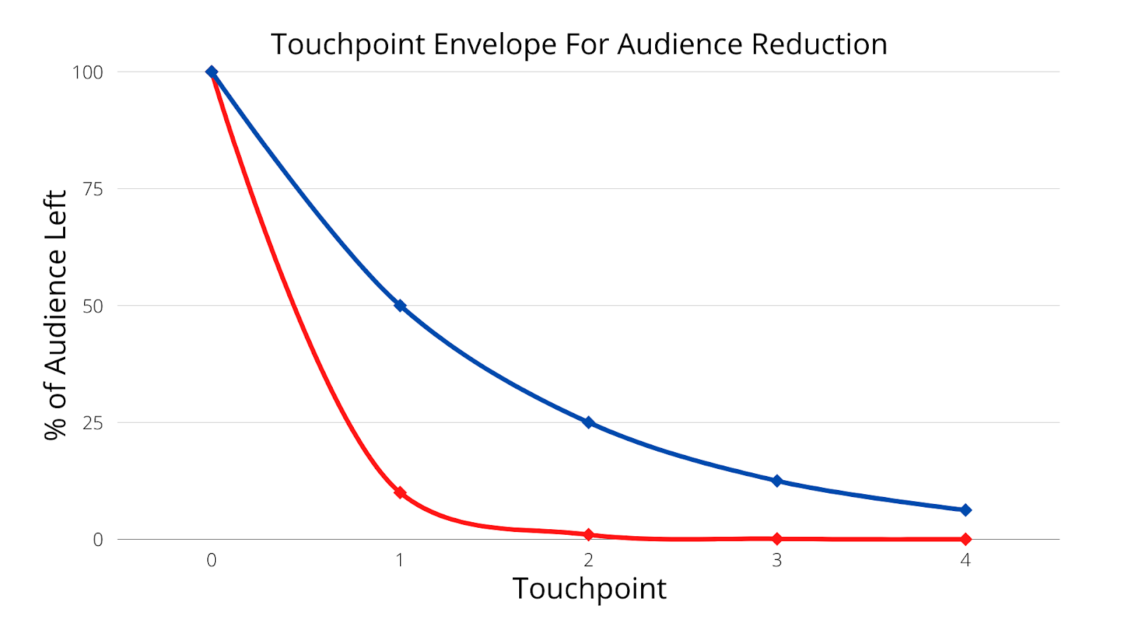
If an outreach falls below the blue line (e.g., less than a 10% Open rate, for example), it could mean two things:
- Too big an audience
- Poor subject line or Lede
- Poor offer
The same can be true for the next touchpoint. Continuing the example of an email, if the Click rate is less than 10% of the Open rate, then you have a poor Call to Action or offer. You can continue that on to a Reply or a Buy or a Signup.
This also applies to the upper limit. If you have a greater than 50% Open rate, then your list is too small. Same goes on down the line. The reason that’s important is because you want to find a good balance between audience expansion and outreach effectiveness. This even applies to small lists, but the numbers skew towards the higher end.
Let’s say that you have a good open rate (> 10%) but a poor Click rate (<10% of Open). This would mean you have a good subject line but a poor offer or CTA. Knowing this piece of important information will help you refine your outreach for the next cohort you send it to.
Some Real Data to Test The Heuristic
The best way to explain this is to show you some actual outreach that I have done and the results I got.
Some Actual Email Campaigns
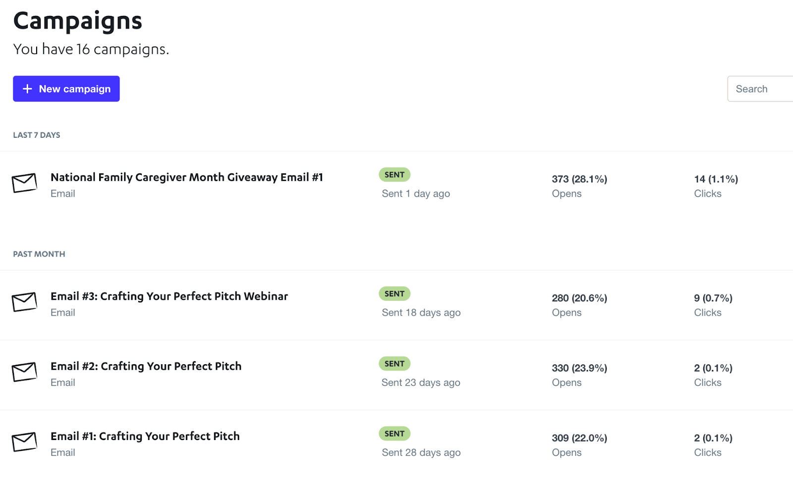
Here are four emails I sent over a month using Autopilot (now Ortto). Three are for the webinar this book is based on and one is because it was National Family Caregiver Month in November.
To understand the Factor of 10 & 2 for the emails above, we’ll look at the Opens and Clicks touchpoint.
If you take a look at these numbers, you’ll see a few things.
- Open rates are > 10% (Factor of 10) and less than 50% (Factor of 2).
- Click rates are below 1% overall. That’s bad, since we would expect at least a Click rate of 10% of the Open rate, or 2.8%, 2%, 2.3%, and 2.2%
So what does this mean?
Well, it looks like the audience size is about right, but my offer is poor. Clearly, the people on my list of about 1,500 are not interested in outreach.
The National Family Caregiver month email tells a different story. Notice that email got the best results on both Opens and Clicks. Still a little low on the Clicks, but above 1%, which is better but not as desirable.
The above examples for bulk outreach are a good level set of what to expect. When it comes to smaller cohort sizes, like the majority of cold email outreach SDO is best at, the numbers will be a bit different.
Let’s take a look.
Respona Campaign Examples
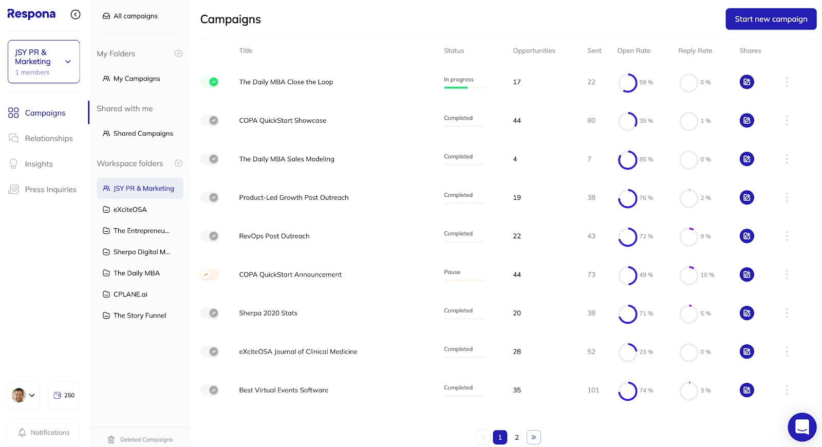
This is my Respona dashboard. It’s the tool I use for outreach to all sorts of people. I wanted to show you this because it has some of the outreach campaigns I have done, and it also automates a lot of the drudgery of outreach.
Before you can use such a tool, you clearly have to have something to outreach and have a solid outreach plan. I wish I could take you through a demo of it, but that would be kinda hard in a book. Feel free to email me at jarie@thestoryfunnel.co and I’ll introduce you to Farzad, Respona’s founder.
If you look at this dashboard, you’ll see a lot of variability in my Response rates, as well as Open rates. Recall when we talked about measures/metrics, and the right audience? That’s why I love using Respona. I can see how well I’m doing.
Notice that a lot of these are over 50% Open rate and high single-digit Replies. This graph shows the trend over time, as well as the overall performance.
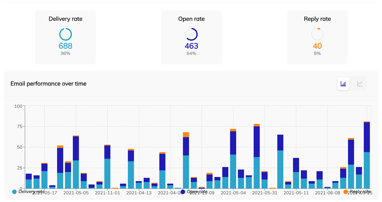
Overall, I’m at a 64% Open rate and a 8% Reply rate. That’s above the Factor of 10 & 2, but as the individual data shows, the variability is wide, with some campaigns having a 0% Reply rate.
Picking Goals for Your Outreach
There are no hard and fast rules on outreach effectiveness other than making sure it got the results you wanted. Some bulk email tools (like MailChimp and MailerLite) do share email marketing benchmark data for Open and Click rates, among other things. See below for their numbers.
On average, across all industries, MailChimp reports an average of 21.33% (range: 15%-28.7%) Open rate and an average of 2.62% (range: 1.3%-5%) Click rate.
For MailerLite, they report an average Open rate of 25.35% (range: 14.5%-39%) and an average of 3.82% (range: 1%-7%) Click rate.
I added all the data points for both MailChimp and MailerLite to the graph below:
We can take Click rate as a rough proxy for Response rate to compare it to my results.
Notice that both of these are between 10% and 50%, which fall within the Touchpoint Envelope. So it looks like we are in the right ballpark. Also note that my Open rate and “Response” rates are at least double (more like triple) those numbers.
A Good Approximation for Planning
While results may (and will) vary, it’s good to have a rough idea as to how your emails, landing pages, and shopping carts should perform. Anything outside the Touchpoint envelope (both good and bad) you should take a look at and figure out why it’s happening. Only through understanding each touchpoint your prospects have to go through will you be able to create that slippery slope that turns prospects into customers.